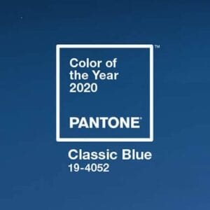
PANTONE 19-4052 Classic Blue is a poised and self-assured blue hue, elegant in its simplicity.
Instilling calm, confidence, and connection, this enduring blue hue highlights our desire for a dependable and stable foundation on which to build as we cross the threshold into a new era.
 Genderless in outlook and seasonless in endurance, this foundational anchor shade enables color mixes throughout the spectrum, yet at the same time, makes a strong statement on its own.
Emblematic of heritage but at the same time highly contemporary, versatile Classic Blue takes on distinct appearances through application to different materials, finishes, and textures from shimmering metallics, lustrous sheens, and high-tech materials to hand crafted mixes and more fragile fabrics.
Offering the promise of protection, Classic Blue is a pervasive favorite for home. Creating a stable foundation on which to build, Classic Blue injects creative confidence into interiors, transforming a space through unique color combinations and tonal statements.
Easily applied across so many different materials, textures, and finishes, Classic Blue is a dependable blue that can take you in many different directions, expressing tradition and elegance, as well as unexpected boldness.
Because of Classic Blue’s relation to the sky at dusk, something we see every day, it maintains a perception of dependability and constancy. A color we respond to viscerally as being trustworthy, Classic Blue is an ideal shade for many applications in graphic design.
This is especially true for packaging, where Classic Blue conveys the message of credibility and reliability that today’s consumers are connecting to.
As technology continues to race ahead of the human ability to process it all, it is easy to understand why we gravitate to colors that are honest and offer the promise of protection. Non-aggressive and easily relatable, the trusted Classic Blue lends itself to relaxed interaction. Associated with the return of another day, this universal favorite is comfortably embraced.
About Pantone Color of the Year
For over 20 years, Pantone’s Color of the Year has influenced product development and purchasing decisions in multiple industries, including fashion, home furnishings, and industrial design, as well as product packaging and graphic design.
The Pantone Color of the Year selection process requires thoughtful consideration and trend analysis. To arrive at the selection each year, Pantone’s color experts at the Pantone Color Institute comb the world looking for new color influences. This can include the entertainment industry and films in production, traveling art collections and new artists, fashion, all areas of design, popular travel destinations, as well as new lifestyles, playstyles, and socio-economic conditions. Influences may also stem from new technologies, materials, textures, and effects that impact color, relevant social media platforms and even upcoming sporting events that capture worldwide attention.


LET’S CONNECT